New User-Friendly FabTime Interface
April 6, 2021
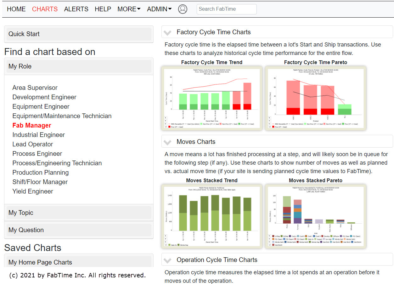
FabTime is pleased to announce the imminent release of Patch 114, which includes a fully refreshed user interface. Our development team worked closely with our User Group to make FabTime easier to use, especially for new users. Their collective goal was to “make FabTime a joy to use.”
The centerpiece of the new UI is a brand-new Charts page that lets users find charts based on their role (e.g., Fab Manager, Industrial Engineer, etc.), their question (e.g., “Which tools have been down > 6 hours?”), their topic of interest (cycle time, holds, etc.), or a recommended set of useful charts. These categories and questions will be pre-populated by FabTime (again, with thanks to our User Group), but can be customized by site. The Charts page includes pop-up sample charts and site-customizable descriptions (e.g., “In our fab, cycle time is recorded from operation 1001 to operation 9050.”). Links are also available to user-specific and shared home page tabs, of course, and to the full list of 150+ FabTime charts.

Other highlights of the new version include:
- Smart search: Quickly find charts, help articles, home page tabs, and newsletters, or jump directly to performance charts for a lot or tool.
- Wafer-level tracking: Store and analyze wafer-level transactions in FabTime.
- Improved Look and Feel: New icons, tool tips, drill-down styling, and responsive layout for mobile devices make FabTime easier to navigate.
Copyright ©1999-2024 FabTime Inc.